

Whether searching for the perfect mural paint to complete a work of art on a large scale or browsing concrete paint to liven up and beautify your outdoor space, choosing the right colour can be challenging.
Luckily, Viponds Paints can help with our years of expertise, experience, in-depth knowledge of the colour chart and how to use colour numbers correctly.
The colour chart many of us are familiar with is the circular one where the colours appear as different pie segments. This was first created by Sir Isaac Newton in 1666, and the principles remain solid to this day. Although a modern paint chart may use a vertical strip of similar colours and tones, the original colour chart contains them all. The colours are arranged as follows:
All colours are derived from three basic ‘primary’ colours:
These are formed by combining any two primary colours:
Tertiary colours are formed by combining a primary colour with a secondary colour, and they can be mixed in any amount to create an infinite number of colour variations.
Colours can also be called ‘hues’, and their level of lightness or darkness is their ‘shade’. Any chosen hue can be lightened or darkened with the addition of a lighter version of itself or white. Similarly, it can be darkened with a deeper version of itself or black/grey.
Complementary colours are those that are tonally opposite to each other in how they interact with our eyes. For instance, if you stare at a sheet of red paper for one minute and then look at a white wall, you will see a green shape.
Complementary colours create bright contrasts that almost always look good, and the principle also works for secondary and tertiary colours. Take a look at your circular paint colour chart and the colours opposite each other:
Contrasting colours are not opposites but seem to almost clash with each other. This can be used sparingly to create bold, striking contrasts that work well together. Use your paint colours chart to pair different colours and judge their appearance together.
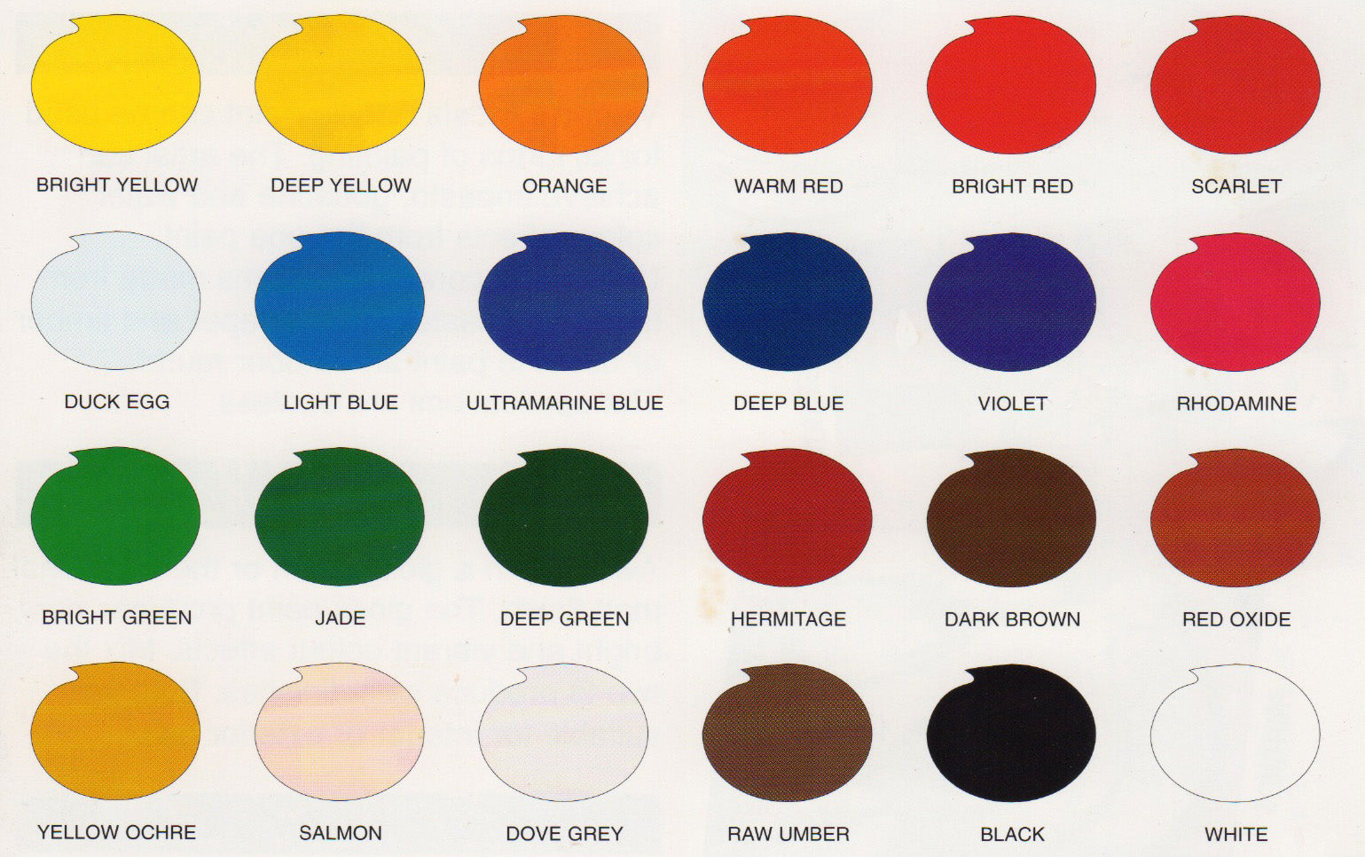
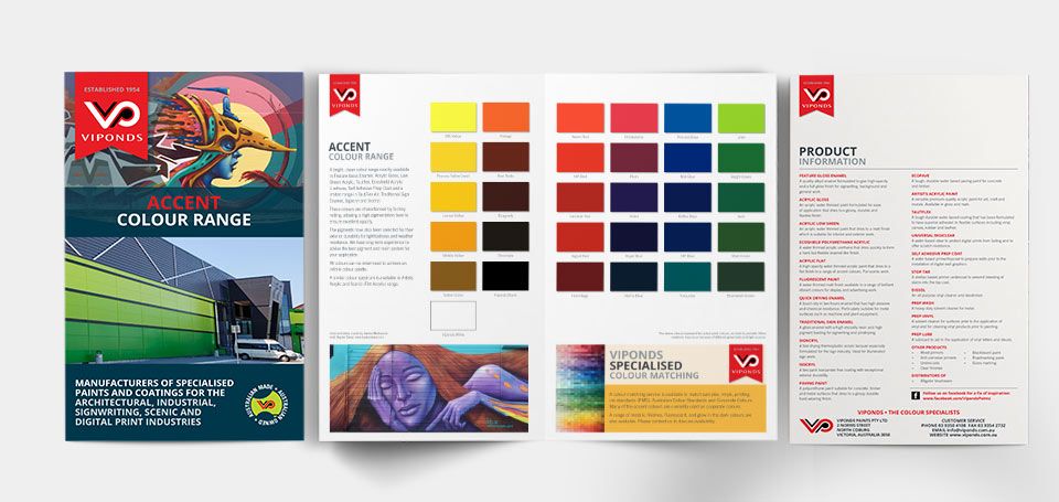
We carry a stock range of highly pigmented accent colours in a variety of enamel and acrylic finishes. These colours and products were developed for the sign industry where high opacity and durable finishes are required. Many of these colours such as process yellow, reflex blue and signal red use unique pigments and are not available as tinters that are used by most paint companies.
These colours form the base to colour match colours that cannot be achieved by other paint companies.
It is now apparent that the Pantone® Colour Matching System (PMS®) is a universal reference for corporate colour specifications. We have vast experience (over 30 years) in achieving close matches to these colours and are able to supply any quantity to a minimum order of 1 litre.
We understand how gloss levels and the type of lighting affects colour. Contact us to discuss your requirements.
We'd love to assist you with specific colours you are looking for or send you our colour cards for our range of standard colours.
Call Viponds on 03) 9688 3800 or us the form at the bottom of this page to select the cards you would like to be mailed to you.
Colours selection swatches on this site are represented digitally. View our colour accuracy terms here.
Our Colour Specialist chops shine through with this range which includes many highly pigmented and sought after colours.
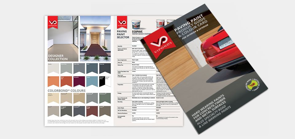
Our Innovative Paving Paint Range can be tinted to unlimited colours, this card has the most popular colours alongside a guide to which products are best for your job.
The ever popular Artist's Paint Colour Card.

When you choose to partner with Viponds Paints for all your art initiatives and premium art supplies, we guarantee:
If you are based in Tullamarine, Victoria, why not drop by our fully stocked Viponds Paints Factory Store and talk to the team in person?
They can answer any questions you may have about your upcoming or stalled projects, and there are literally hundreds of premium art materials to give you inspiration and creative direction.
Whether trying to fix patches of discolouration on the wall or looking for a new colour scheme to revamp the whole house, you can find the right match easily using the Pantone Colour Matching System. Simply take a sample of the colour you wish to match and compare it to the colours on a Pantone colour chart, finding the correct name/code for the colour you want.
At Viponds, we also have colour scanning software to identify the paint colour pigments you’re looking for correctly. If you’re unsure about what colour you need, consider getting a Pantone colour card and holding each of the shades up to the wall you intend to paint.
Suppose you want to paint your awnings, furniture, or blinds in a Pantone colour. In that case, Viponds offers a wide range of products touching on many specialities, including TautFlex DIY, wall paint, exterior building paint, door paint and metal paint, which can be made in any Pantone colour of your choosing.
A Pantone colour is any colour classified under the Pantone Colour Matching System. The Pantone colour palette consists of more than 1,000 colours and even encompasses opaque and transparent colours. Once a year, Pantone also works with other representatives from various nations' colour standards groups to release the “Color of the Year”. For example, the Color of the Year for 2022 is Very Peri (#6667AB).
If you need help deciding on the right colour for your home or having trouble finding your preferred colour at any of our specialty retail stores, then feel free to contact us and we’ll be more than happy to assist you.
With there being almost countless variations of colours and shades, it can be difficult to find a standard form for what people might call dark blue or deep red or acid yellow. That is why the Pantone Colour Matching System, or PMS, was invented. It is basically a standardised colour-matching system created to help printers and designers specify and control colours for printing projects.
No matter what Pantone colour you need, our specialist can achieve the shade you need whether its wall paint, exterior building paint, door paint or metal paint.
If you’re wondering how to colour match paint or choose the right paint colour without an existing scheme, there are some general principles to consider:
It is a safe bet to use a combination of the colour principles mentioned above, and a paint colours chart is perfect for this as it contains them all.
Using a base colour chart is the best way to match your paint scheme without a sample and achieve the best results. Seeking advice from one of our experts is ideal.