


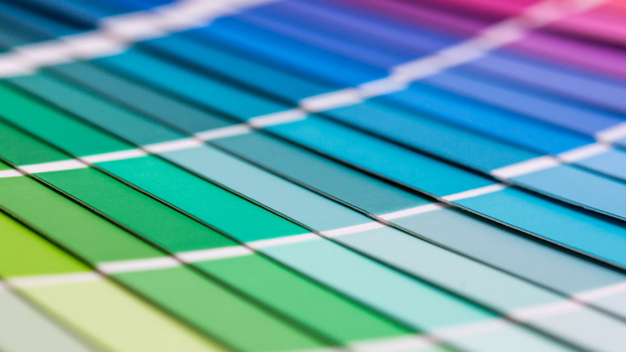
Colour is a fundamental part of the visual world that can influence our emotions and decision-making. Whether in the home or a commercial setting, the colours chosen can have a profound effect on the perception of the people who reside within them. This is why having a good grasp of Pantone Colours is essential. Used in numerous sectors, Pantone Colours are significant in the world of paint and design for their standardised and universally accepted colour codes. But what are Pantone Colours? What are the criteria that go into deciding what colours are Pantone, and how does this influence the paint used in branding, harmony and interior design?
In this short but comprehensive guide, we’ll answer all these questions and more.
What is a Pantone Colour?
Pantone Colours, commonly referred to as Pantones, is a system of standardised colours. Each colour in this system is assigned a unique code and name, ensuring that that everyone can refer to the exact shade of colour they desire. It is important to note that Pantone Colours are just a random assortment of hues; there isn't a special list of criteria that determines what colour is Pantone and what colour is not. Instead, Pantones are a carefully curated spectrum that represents the full range of visible colours.
It is because of this standardisation that the use of Pantones is so prevalent in multiple industries. Professionals and organisations — such as artists, graphic designers, interior designers, architects and businesses — can select and specify the exact colour they need for a project with a very high degree of accuracy.
Pantone Colours in paint
The colour of paint can be a very important and tricky thing to get right. Large-scale projects require uniformity in their colours, and mixing the paint by eye simply cannot guarantee that the current batch will be the exact same colour as the last. This is where Pantone Colours comes to the rescue. Now that you know what a Pantone Colour is, let’s discover the benefits that Pantones provide in the world of paint:
- Precision and consistency — Paint batches can differ in colour due to its manufacturing process, levels of pigments and even environmental conditions. Pantone Colours allows you to ensure consistency in the colour of every batch. All you need to do is give the manufacturer the specific code and name of the shade you desire.
- Accurate colour communication — It can be difficult to communicate to other people the exact colour preferred in a project. Simply saying that you’d like a wall to be green leaves a lot of room for interpretation, since there can be an infinite amount of shades of green. Designers, architects and clients rely on Pantone Colours to communicate their colour preferences accurately by simply providing a code. This eliminates any ambiguity and ensures that the intended colour is understood and replicated correctly, reducing the margin for error.
- Branding and identity — Having a clear and consistent brand identity is essential to promoting brand awareness and recognisability among consumers. This is why Pantone-matched paints play an integral role in establishing visual coherency in things like the logo, promotional materials and interior/exterior design of branches in different locations.
- Customisation and creativity — When trying to make your project unique, or creating truly original works of art, the standardised system of Pantone Colours makes it easy for designers and artists to explore the full spectrum of visual colour, finding the ones that truly stand out.
- Colour harmony — A harmony of colours is a fundamental aspect of design. Whether it’s selecting complementary or analogous colours, you can easily navigate the system and find the Pantone-matched paints you need to create visually appealing and harmonious designs.
- A consistent theme in digital media — In architecture and interior design, it's essential to align physical spaces with branding materials seamlessly. Pantone-matched paints help bridge the gap between the digital and physical realms by ensuring that the colours used on walls, furniture and other design elements match the colours specified in online branding materials. This consistency enhances the overall aesthetic and reinforces the brand's identity within the physical space.
In a world where colours evoke emotions, convey messages and define identities, Pantone Colours stand as beacons of precision and consistency. They provide a standardised language for colour, enabling professionals in various industries to achieve colour perfection while preserving accuracy and aesthetic integrity.
If you’re looking for the right colour for your space based on the Pantone Colour system, turn to Vipond Paints. Using the Pantone Colour Matching System, a universal reference for corporate colour specifications, you can find the right shade and hue you desire. We have over 30 years of experience in achieving close matches to these colours and can supply any quantity to a minimum order of 1 litre.
Get the colour you need at Viponds Paint today!
Whether you’re looking for Pantone Colours for a commercial or residential project, or any other type of paint, Viponds specialises in catering to different painting needs, including ones for shop-fitting, mural artistry and signwriting. As a leader in the industry, we are committed to providing the highest-quality paint products and superior customer service. Browse our range in specialist retail stores or online and enjoy Australia-wide shipping and secure payment options.
We'd love to assist you with the specific colours you are looking for, we can even send you our colour cards for our range of standard colours. Contact us today, and we’d love to assist you in any way we can.